After some more SQL, some pointing and clicking, some jiggery and a fair bit of pokery, some more useless graphs have appeared. The paper committee members rated all proposals on a scale of -2 to +2, and this of course lends itself to the creation of lies statistics.

This gives you an idea of the average rating assigned by day on which the rated proposal was submitted. This data is split out for all proposals, rejected proposals and accepted proposals. Note how a high rating does not mean an automatic place in the programme.
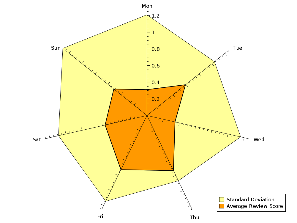
This chart gives you an indication of what score a reviewer is likely to assign a talk, depending on which day of the week it is. I've thrown in the standard deviation as well. Mainly, this is because I wanted to do a radar chart and haven't done one yet.
Note how reviewers will assign lower scores on a Monday (with a pronounced disagreement) and much higher scores (and more agreement) on Thursdays.
Add new comment